3 Rapid-Result Fixes for Superior Web Conversions

You might think that today’s social media-dominated digital market holds little place for websites. Many B2B companies thrive on platforms like LinkedIn, engaging their audience directly and interacting with potential buyers directly through messages.
But here's the twist: A whopping 70% of shoppers kickstart their buying journey with an online query, expecting to find all the necessary information on your website. Shockingly, despite their striking web designs, many businesses drop the ball when inspiring visitors to take the plunge. They're leaving money on the table!
And why do they stumble? From snooze-worthy calls to action to long-winded text that's all about them instead of catering to visitors' desires. The outcome? Opportunities lost and potential customers untapped. But don't worry – this article is your shortcut to supercharging your website conversion game.
Swift and Effective: Three Time-efficient Methods for Skyrocketing Website Conversion
Let’s start with the good news. Boosting your content’s performance doesn’t have to be a months-long hassle. With our copy and web design hacks, you’ll transform your website in minutes. Identify conversion roadblocks, captivate customers, and enjoy higher conversions without spending hours on tweaks!
1. Spur interaction with CTAs

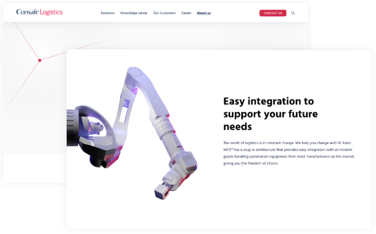
Without CTAs, the purpose of this page is unclear.
What’s wrong? Missing CTAs
Creating effective calls to action can be challenging, with numerous rules to consider. But the biggest mistake you can make is leaving them out entirely. CTAs strategically guide user actions, whether boosting engagement, spurring sales, or gathering crucial contact details. Without CTAs, you miss out on valuable leads and conversions. Don't skip this essential step!
How to fix it?
If you want visitors to book a product demo, sign up for a newsletter, or purchase, add CTAs to essential copy sections and watch your website conversion grow. Your CTAs should be clear, concise, and straightforward, explaining what you expect from your users. Place them strategically at points in the user journey where they make the most sense and create a sense of urgency using actionable language.
2. Enhance readability

Long sentences, long text walls, and a lack of formatting make the copy hard to scan and read.
What’s wrong? Poor text presentation
Consider this website for a moment. Imagine a visitor arriving here. Would they be enticed to stay and engage with the content, or might they be inclined to search for a more inviting webpage? The challenges arise from the presentation – extensive text blocks, inconsistent headings, an excess of font styles, and a lack of consistent formatting, potentially discouraging users and leading them to exit the page.
How to fix it
To address this problem, let's take a user-friendly approach to text. Make your content clear, easy to skim, and visually pleasing. Break it into smaller sections, organize it with headings, and use bold, italics, or capitalization when necessary. These simple steps will create a smoother, more enjoyable experience for visitors and enhance your website's conversion power.
3. Quantify your success

Important data would bring more value to the website if placed in the heading.
What’s wrong? Hiding metrics
See this copy? It’s one step from perfect. Except it doesn’t use data to its full potential. By not putting metrics in the spotlight, you’re missing out on a chance to attract more eyeballs and persuade your audience to take the next step.
How to fix it
If you want to get users’ attention and prove your credibility, highlight numbers in titles, headings, and stand-alone blocks for maximum impact. Incorporating metrics within headings is more than just a design choice; it's a strategic move that can substantially enhance user engagement, positive brand perception, and website conversion rates.
Continue the Trend: Keep Website Conversion Rates High
Creating the perfect website from scratch is a complex journey, calling for expertise across multiple domains. It's an investment, too, with website costs ranging from $12,000 to $150,000 and an average timeline spanning 5 months from concept to a fully operational site. The road to web excellence might seem daunting, but here's the silver lining: you can make substantial enhancements right now with quick, cost-effective tweaks. Boosting efficiency and conversions is just a few steps away.
Ready to take action? Dive into our FREE guide for a wealth of insights on supercharging your conversions with copy and web design enhancements. For a more personalized touch, connect with us at hello@6minded.com to schedule a call and explore how we can transform your website into a conversion powerhouse!
Find out more about 6Minded here
)

)